TwinaForms Help
Designer basics — build your first form.
A walkthrough of the TwinaForms Designer: the three-pane workspace, adding fields to the canvas, configuring how each field looks and behaves, and getting a form ready to publish. If this is your first time, follow the sections in order — each one builds on the last.
Open the Designer
The Designer is part of the TwinaForms managed package. After installing the package, open the TwinaForms Lightning app from the App Launcher in Salesforce.
From the Desginer tab, click an existing form to open it — or click + New Form to create one. The current Draft version opens in the Designer.

The workspace
The Designer has three panes:
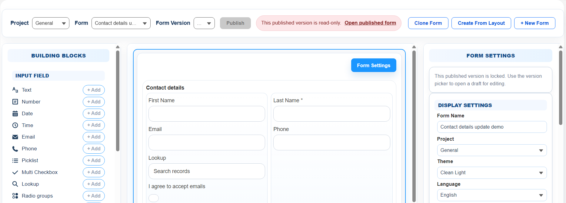
- Building Blocks (left) — the palette of fields and elements you can add.
- Canvas (centre) — a live preview of the form, exactly as the end user will see it.
- Properties panel (right) — configures whatever is currently selected on the canvas. When nothing is selected, it shows Form Settings.
Along the top there's a toolbar with Project, Form, and Form Version selectors, plus a Publish Form button.
Add a field to the canvas
Fields are grouped in the Building Blocks panel into three categories:
- Input Fields — Text, Number, Date, Time, Email, Phone, URL, Text Area, Picklist, Checkbox, Radio groups, Multi Checkbox, Lookup, File Upload, Signature.
- Display Elements — Section, Group, Records List (repeat group), Display Text, Image.
- Survey Fields (Pro) — Star rating, NPS, Likert, Ranking.
To add a field, click its + Add button. The element appears at the bottom of the canvas — or inside the section you currently have selected — and is automatically focused so you can configure it right away.
Configure look & behavior
When a field is selected, the right-hand Element Properties panel opens. Most fields share the same common controls, with a few type-specific extras.
Common controls (every input)
- Label — the text the user sees above (or beside) the input.
- Placeholder — hint text shown when the field is empty.
- Help Text — smaller text under the field, used for guidance.
- Required — submission fails if the user leaves the field empty.
- Default Value — the value the field starts with when the form loads.
- Field Behavior — Editable (normal), Locked (read-only when prefilled), or Hidden.
- Conditional Show/Hide — toggle visibility based on the value of another field. Multi-condition AND/OR logic is a Pro capability.
- Internal Name (ID) — auto-generated identifier like text2 or email5. Used in formulas, prefill, and submit mappings.
Look controls
- Label Position — Above, Left, Right, or None.
- Label Formatting — Bold, Italic, Underline.
- Width — not set directly. Field width is controlled by the column count of its parent Section. A 2-column section makes each child take half the row.
Type-specific controls
Some field types have a few extra controls:
- Text, Email, Phone, URL, Number — Min/Max value, Text Rule (numbers only, letters only, alphanumeric).
- Date, Time — Display format (US / EU), 12 or 24 hour, GMT offset for datetime fields.
- Picklist, Radio, Checkbox — Option list (value/label pairs), or fetch options from a Salesforce picklist field.
- Lookup — Target Salesforce object, search fields, display fields, minimum search length, result limit.
- File Upload — allowed file types, max size, the Submit Action that owns the attachments, and AWS malware scanning before attachment.
Link portal journeys with Buttons (Pro)
Pro plans can add a Button element for navigation without creating a submitted field. A Button can open another published TwinaForms form or an external https:// page in the same tab.
Use query parameters to forward values such as an email or record identifier. Values are encoded when the user clicks the Button, and blank dynamic values are left out of the link.
- Turn on Submit Form Before Navigation when the current form must save successfully before the visitor continues.
- Buttons inside a Records List can build links from the clicked row, but cannot submit the form.
- Only pass identifiers the destination needs; Buttons do not automatically expose secret codes or internal publishing values.
Organize with sections and columns
Add a Section from the Display Elements group when you want to group related fields and lay them out side by side.
Section settings include:
- Columns (1–10) — how many columns the section's children are laid out in.
- Show Title — whether the section's title is visible.
- Boxed — whether to draw a border around the section.
Reorder and delete
- Reorder — drag an element to a new position on the canvas. A target line shows where it will drop.
- Delete — select the element. In the right-hand Element Properties panel, scroll to the bottom — you'll find the Delete button there.
Form settings
Click anywhere outside an element on the canvas (or click the Form Settings button) to switch the right panel to form-level settings.
- Name / Description — identifies the form internally.
- Language — the default form language. Affects element default labels and built-in runtime text.
- RTL Mode — right-to-left direction for Hebrew, Arabic, and similar languages.
- Theme — the visual theme (colors, fonts, logo, width). See Form themes.
- Submit Button Label and Success Message.
- Post-Submit Redirect (Pro) — URL or formula that decides where to send the user after submission.
- User Verification on Form — require a one-time verification code before the user can fill the form.
- Submission PDF (Pro) — attach a PDF of the submission to the created Salesforce record.
- Custom JavaScript (Pro) — see Custom JavaScript.
Save and publish
You won't see a Save button anywhere — the Designer auto-saves continuously in the background. When you're ready for users to actually fill out the form:
- Click Publish Form in the top toolbar.
- TwinaForms takes a snapshot of the current Draft and generates a public form URL.
- A new empty Draft is created so you can keep editing without affecting the published version.